Monday, February 27, 2012

My Top Five Oscar (Gamble) Picks

Congrats to tonight's Oscar recipients, including vintage actor Christopher Plummer, the statuette's oldest winner. It's never too late for any of us! And it's really never too late to take a gamble on Oscars.

Known in the 70s and 80s as a solid hitter and fielder, Oscar Gamble's notoriety lives into the 21st century as a cardboard deity, thanks to some amazing hair and Topps' propensity for letting their art department handle details like "current team" and "uniform."

My own Oscar collection started at age 6, with this 1978 Topps card.


I didn't know it then, but Topps' airbrushing of Oscar as a Padre standing in Yankee Stadium (note the BRUT billboard) just followed a pattern they'd established many years before.


Bonus photo: another padre in Yankee Stadium. Pope Benedict's red boots required no airbrushing. They're real.

Next came 1977 Topps, with Oscar airbrushed into a curiously black Yankee cap. What it lacks in afro, we get back double in sideburns.


Gamble spent all of 1976 with the Yankees, but Topps continued to struggle with his hair. Editors for this card retouched the edges and bill to turn what looks like a batting practice helmet into a NY "cap." (Sideburns still make it worth your while.)

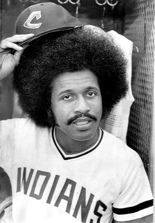
Next up, number three: Oscar as a funky Cleveland Indian.


1975's arguably a better card than the others on this page, given its strong pose, mustache/hair combo, smooth signature, and border colors. Night Owl doesn't see airbrushing here, but the cap's color contrast doesn't match Oscar's uniform, a giveaway that something's fishy. I suspect they retouched a real 1974 Indians hat to bring out the logo and bill.

Some call 1976 Topps Traded an apex of airbrushing and others, the nadir. With due respect to Keats, I see its Oscar Gamble as Topps' own Ode To Grecian Formula and a classic among baseball cards.


What were the artists trying to do with his shoulders? You'd get better physiology from three blind mice with paintbrushes. Also compare his hat brim to 1975's card. Both photos probably came from the same photo session.

Finally, my personal favorite Oscar: this dusty traffic pileup on the Philly interstate between first and second base.


Of all the 70s Gambles to take, I like this one best for its action shot and (finally) lack of airbrush work. Topps updated the team to reflect Oscar's off-season trade to Cleveland, but left him in this Philadelphia dust cloud with a bouncing hat and three Cincinnati Reds reacting to an umpire's call off-picture to the right.

Based on its SS-2B-CF positioning, this is one of two plays from the regular season.
  • Sat, June 4, bottom 1st: Gamble advances to 2B on infield single. They might've tried to force Oscar on a difficult play and the scorer credited Luzinski with a hit instead of a fielder's choice. SAFE.
  • Tue, August 15, bottom 2nd: Gamble caught stealing C-2B, ending the inning. Oscar didn't steal often (he only attempted it once in 1972), so it could be a failed hit-and-run. This is probably what's shown on the 1973 card. OUT.

Retired from the game but always dressed for success, Oscar Gamble. Hats off to him.

Friday, February 24, 2012

Type Site: LIFE Magazine's Best Photos (and Mickey Mantle)

"Do you like quality photography? Of course, we all do."


If so, don't miss out on LIFE Magazine's (self-selected) list of best photos, which slots this shot of Mantle denouement at #30.


Two ravaged knees killed Mickey's on-field production and his obvious frustration in this photo presaged the late 60s fade of both superstar and franchise, as he limped towards retirement and New York sank into the AL's second division.

But LIFE Magazine and The Mick appeared in this blog before--and in happier times--thanks to their Maris/Mantle Post Cereal promo from 1962.


This card (as trimmed from LIFE's gatefold insert) followed the 1961 wave of home run hysteria, when Roger and Mickey raced to break the Babe's mark of 60.

It's hard to imagine a sharper career descent than Mantle's, given both his diminishing production (though never below average) and New York's ill fortunes. Would 1960s fans (and teams) have accepted a DH rule just to extend the careers of sluggers like Mickey?

Thursday, February 23, 2012

Retro Redux: 1954-55-56 Topps Ted Williams

Does this picture of Ted Williams look familiar?

1954 Topps #250, Ted Williams

How about now?

1955 Topps #2, Ted Williams

Or now?

1956 Topps #5, Ted Williams

Topps publishes lame photos from time-to-time in modern sets, but you see more variety because they have a larger stock to pull from. Back in the 1950s and 60s, card editors fell back to re-cropping, re-using, and re-composing a high percentage of player shots year-to-year, especially when they had a "good one," like Ted's genial portrait.

Night Owl recently called out 21st century Topps for endlessly revisiting the same Jackie Robinson image that first appeared on a card in 1950. Bowman held exclusive rights to Ted Williams prior to 1954, so who knows? Maybe Topps would have used that quality closeup even earlier if they could've done so.

1951 Topps Blue Back-style Ted Williams

Ahhh, something a little different. At least Ted's early Topps tribute cards went with alternate poses. The 1954, 1955, and 1956 sets include so much photo re-use, they could almost be a blog of their own.

Monday, February 20, 2012

Type Site: Cards That Never Were #5, 1969 Topps Lou Piniella

Hope that you already read the blog Cards That Never Were, but just in case you don't, here's another excellent reason to start: future MLB star (and likely HOF manager) Lou Piniella in a Pilots uniform.


I follow Sweet Lou for several reasons, both sports and card related. The fact that it's Fan Favorite #5 is icing on the cake!

Back in 2010, I marked Lou's retirement with a profile of his 60s cards that showed his multiple pre-rookie appearances and how mixed-up Topps photos got during the expansion era.


This 1970 Topps Super, for example, shows Piniella hatless in a nondescript uniform, despite his winning AL Rookie of the Year for Kansas City at age 26. Lou's young, swarthy face doesn't resemble his 1969 skin tone, though--it looks like an alternate 1963/64 photo with the Washington Senators.

1964 Topps #167, Brumley / Piniella

Best I can figure, Topps thought a "Rookie of the Year" should look fresh-faced, so turned the clock back 7 years. Mission accomplished!

Thursday, February 16, 2012

Poll: Would you rather have Mantle or Wagner?

I swapped a few messages with Cardboard Icons today about the pursuit of a playing-era card for the Hall of Fame's first class of inductees: Walter Johnson, Babe Ruth, Ty Cobb, Christy Mathewson, and Honus Wagner. He's got a type card for all but the Wagner, which proves elusive given the Mona Lisa status of Honus's T206.

"The Holy Grail" by Tim Carroll

Our chat made me wonder: would collectors rather have an early Wagner (other than T206) or one of the Mantle rookies? It takes more than a grand to land a low-grade, authenticated tobacco Wagner or Mantle RC, so it's not a decision made lightly.

The most-desirable Wagner cards range from late 19th century cabinets to early 1910s tobacco cards, so I plucked a couple of his "cheaper" options to go up against The Mick's 1951 Bowman and 1952 Topps rookies. Which of these four would you rather spend $1000-2000 on? (Assume all are in equally low grade.)

1908 E98 Anonymous "Set of 30"
1914 T216 Peoples Tobacco
1951 Bowman #253 (my personal fave)
1952 Topps #311

FINAL RESULTS: 1952 Topps Mantle gets 50% of the vote, with the other voters split evenly between the 1951 Bowman and two Wagners. 1952 Topps, still the collector favorite! Thanks for voting, everyone.

Wednesday, February 15, 2012

1976 Kellogg's Baseball #5, Jim (Catfish) Hunter

Kellogg's packaged their plastic baseball cards with cereal throughout the 70s, but added a red-white-and-blue flourish for America's 1976 bicentennial, surrounding each player in an oval of freedom, motherhood, and apple pie. Today's set includes 57 players and several variations; find its checklist at Key Man Collectibles.


You don't need 3D glasses to see that the Yankees haven't been clean-cut forever. They put a lot of prominent facial hair on display in the 1970s, including one of my type card faves, Thurman Munson.


Now that's a pitcher-catcher battery with something to say about the importance of quality shaving products.


Holy resin bags, 30 complete games! Just this week, Andy of High Heat Stats wrote about pitchers with more CGs than victories and Catfish cleared that bar by a touchdown in 1975.

High Heat commenter MikeD noted that incoming Yanks manager Billy Martin rode his aces hard, even compared to other teams with 4-man rotations.
"...[Billy Martin] deserves the majority of the blame. Looking back at Hunter’s gamelogs August forward, it’s just insane, even for the period, as the Yankees were out of the race.

When Hunter showed up in camp the following season, there were already whispers his arm was sore and there was discussions of diminished velocity. So what did Martin do? What the heck, have him go another 300 innings and 20+ complete games."

It's reasonable to blame the end of Hunter's effectiveness on 600+ innings in two years, as his final three years (1977-79) barely totaled what he pitched in 1975 alone. Fortunately, five championships and a perfect game also garner respect from Hall of Fame voters. They made him one of Cooperstown's youngest inductees--at just forty-one--in 1987. (Sandy Koufax was the youngest, at 36.)

Value: This type card's in better shape than most in the collection, but Catfish still cost less than $5. They're pretty easy to find online or at shows, thanks to plentiful Kellogg's production.

Fakes / reprints: Haven't seen any in the marketplace.

Monday, February 13, 2012

1971 Kellogg's Baseball #5, Roberto Clemente

Today's #5 features Roberto Clemente, one of our pastime's most significant players and humanitarians. Baseball fans know him for his all-around excellence, including his 3000th hit...


...and 1960 World Series victory (game 7 highlights below)...


...but he deserves the longer, biographical treatments of shows like SportsCentury (30 minutes in 4 parts).


Roberto played away from the national spotlight of New York and Los Angeles, but many collectors find him an appealing specialty, so demand remains high decades years after his passing. (I place his hobby value on level with Willie Mays and Sandy Koufax, just a step below Mantle and Ruth.)


This Kellogg's pseudo-3D card looks much like many others found in a 70s cereal box, but that Pirates uniform's not just any "home whites," it's a trend-setter. From the MLB's uniform history page:
1970: The Pirates became the first major league club to adopt the new double-knit fabric uniforms, which they debuted at the first game at the new Three Rivers Stadium. The jersey became a pullover with no button or zipper. The pants contained a built-in sash belt. The cap crown was mustard yellow with a black bill. Within two years, nearly every other club was wearing a double-knit uniform.

New stadiums and "big team changes" go hand-in-hand. Just ask the new-name, new-park, new-uniform Miami Marlins.


CARD BACK TRIVIA: Rudy York still holds the AL mark of 18 homers in one month, one of baseball's longest-standing power records. Sammy Sosa set the MLB standard by clubbing 20 in June, 1998.

Card blogger Night Owl wrote a personal retrospective on the Kellogg's evolution called Shrinkage and it's worth your reading time. I've only finished one of its sets (my birth year, 1972), but a 1970 Kellogg's Jim Palmer was once the Oldest Card in my Collection.

Value: Clemente's a key card in any set, so cost more than the low-grade average of a dollar or two. Pretty sure I found this on eBay for $5.

Fakes / reprints: Haven't seen any in the marketplace.

Friday, February 10, 2012

1972 Kellogg's All-Time Greats Baseball #5, George Sisler

Kellogg's packaged a pair of 3-D baseball sets with their cereal in 1972, probably as a hedge against the first MLBPA labor strike. Financial issues loomed ever larger in the late 60s and early 70s as the players union won important legal victories against team owners, so card publishers made their own backup plans. (Several "All-Time Greats" sets from the 1950s and 60s follow a similar pattern, appearing as ways to save on team or player licensing fees--baseball cards remain a business, no matter what the era.)


So how did this particular set appear in 1972 cereal boxes? I imagine the release planning went like this.
  • In late 1971, Kellogg's starts work on a "regular" 1972 baseball set with active players
  • Players and owners fail to reach a labor agreement during the off-season
  • Kellogg's dusts off this All-Time Greats set from 1970's Rold Gold pretzels, in case the MLB cancels their 1972 season
  • Kellogg's updates the set to a 1972 date and packages them in cereal boxes
  • Strike wipes out first two weeks of the season before labor agreement reached
  • Kellogg's adds "regular" baseball to cereal boxes once baseball resumes

Collectors say cereal boxes with this 15-card set came out after their active player set (1972 Kellogg's #5, Bill Parsons), but it's likely Kellogg's printed these cards in advance and switched to All-Time Greats once "regular" stock ran out.


HOFer and hitter extraordinaire George Sisler picked up the nickname "Gorgeous George," but this photo isn't particularly dashing. His rugged good looks show up better in large photos.


Value: All-Time Greats contain only big names, but low-grade types still run just a few dollars. Find the full checklist at Key Man Collectibles.

Fakes / reprints: This set's an almost exact copy of 1970 Rold Gold baseball, so collectors often confuse the two. Look for the 1970 (Rold Gold) and 1972 (Kellogg's) copyright date.

Thursday, February 9, 2012

1972 Kellogg's Baseball #5, Bill Parsons

I've set the WABAC machine to 1972 for something 70s collectors will recognize from their breakfast cereal days. Today's 54-card set (not including a couple dozen variations) marked the third annual XOGRAPH 3-D effort from Kellogg's, who picked up the funky visual technology soon after Topps tested it internally.


Thanks to my taste for low-grade, this Brewers right-hander has so much craquelure he looks like stained glass. As seen in other Kellogg's posts, the two-layer plastic cards age poorly because their fronts shrink slightly over time, but the backs don't. They start by curving at the top and bottom, then become fragile and vulnerable to creases or cracks. Once cracked, they never go back!

Even when they don't crack, the curling is a real issue for high-grade collectors. I have seen others flatten curved-but-uncracked Kellogg's with a hair dryer or iron (protected by a towel to avoid burns and melting). The newly-flat cards apparently remain that way for a month or two before starting to shrink again.


THREE FACTS FROM THE CARD BACK!
  • Kellogg's cropped and reused Bill's mug for their black-and-white inset photo, typical of this set. Guess they couldn't spend the money to license another image.
  • Bill's hobby is "sports."
  • It's A Baseball Fact: Prior to Nolan Ryan's 7 no-hitters, Sandy Koufax held the record with 4. Bob Feller, Cy Young, and Larry Corcoran are now tied for third with 3. Jason Varitek is the only catcher to call 4 no-hitters.

Read the XOGRAPH articles at Topps Archives for much more about the company's 3-D experiments!

Value: Low-grade Kellogg's cost a dollar or less. Even the stars go cheap when the cracking sets in. Roberto Clemente is the key card for 1972's set.

Fakes / reprints: Haven't seen anyone try to fake 3-D Kellogg's cards, thanks to their unusual construction and relatively low value.

Monday, February 6, 2012

1964 Topps Baseball #5, NL Strikeout Leaders (Koufax, Maloney, Drysdale)

This card of two HOFers and an unheralded 60s ace came courtesy of an OBC trading partner. (If you're reading, thanks, Mike!)

Vintage fans talk a lot about Koufax and Drysdale, but why do so few outside of Cincinnati know Maloney? A peek inside his career numbers says a lot about the importance of playing for winning franchises.


Maloney won 15+ every year from 1963-68 (and 20+ twice), averaging over 200 Ks annually for good measure. Unfortunately, Cincy finished 5th, 2nd, 4th, 7th, 4th, and 4th in the NL during that span, so fans know Sandy Koufax (LA won four pennants that decade) and Bob Gibson (StL also won four) as the prototypical 1960s aces, thanks in part to recurring post-season appearances and success.


Maloney led the NL in strikeout rate for 1963 (9.5 per nine innings), but finished 2nd to Koufax in wins and Ks by making seven less starts and pitching 60 fewer innings. Note that Koufax won both the MVP and Cy Young awards that year. Given an equal 40 trips to the hill, I think Jim would've pushed Sandy for the Cy Young and diverted many MVP voters to a top hitter, like Hank Aaron or Willie Mays.

TRIVIA: 1963's top 25 MVP vote-getters included seven pitchers and three Dodgers: Koufax (1st), Perranoski (4th), and Drysdale (21st). Maloney finished 19th and appeared in the fewest games of anyone receiving votes.

1964's white borders and block letters look "clean," which is a nice way of saying "kinda dull." A few, like #125 All-Star Rookie Pete Rose, stand out for their youthful enthusiasm, but many just take up space in the binder.


If you're a big fan of high-quality, engaging photos from the same year, check out 1964 Topps Giants instead (#5 type profile).

Speaking of great players from Cincy...

Any big fans of the regular set want to rise to its defense? I suppose it's better than 1969's omnipresent airbrushing, but a step back from 1962's wood grain and 1963's bright colors and multi-photo fronts.

Value: Koufax and Drysdale or not, low-grade versions of today's #5 cost less than $10. (League leader cards often cost less than half of single-player equivalents.)

Fakes / reprints: Topps will use 1964's base design for next year's Heritage set. Since those mid-60s salad days, our sport's grown from 20 to 30 teams, expanded from two to six divisions, and added three playoff series per league, but it's still the same company making cards!

Friday, February 3, 2012

Type Site: Night Owl Cards (and its first look at 2012 Topps)

Props to fellow card blogger Night Owl for an early look at 2012 Topps. His post captures their quantitative leap in player photos, a few of which I borrowed for commentary.


I don't blame collectors who specialize in "cool catcher gear" cards. The so-called tools of ignorance offer some of the coolest evidence of our sports' evolution, as with today's hockey-style protective masks.


This Matt Kemp promo is sort of a number five, as it's cataloged GGC-5. Topps upped the stakes in this year's online unlockable "contest" by manufacturing some (real) gold cards. Everyone loves the precious metals!


SEE YA. BOOM. Better call the Na-police and put out an APB on that baseball.

Color me impressed by this year's first look at Topps handiwork. Will it keep everyone coming to the candy store and (more importantly) attract new customers into the fold? Once our new baseball season ramps up, I wouldn't be surprised.

Was this my first week of all Type Site posts, Mon/Wed/Fri? I think so, but fear not: #5 card profiles will return as normal next Monday. (And as always, find entertaining baseball excellence at Night Owl Cards.)

Wednesday, February 1, 2012

Type Site: Keith Olbermann's Baseball Nerd, 2012 Topps Pack Opening Day

It seems impossible to me that people in the hobby wouldn't know how serious a baseball card collector Keith Olbermann is, but who knows? It could still be the case. Let's confirm it now with a photo of the selfsame writer and TV host at Topps' 10th Annual Pack Opening Day.


Keith donned his best uni for the occasion, a game-worn Matt Morse jersey from the Tampa Bay prospect's first win. To prove his cardboard bona fides, Olbermann also brought one of his favorite cards.


Oh hey, a T206 Honus Wagner. (Keith claims to own three of them; maybe this is the "Weekend Wagner.")


I've no particular political leanings, but remain a fan of Olbermann's for the part he played in TCMA's growth and success in the 1970s and 80s, as a key maker of oddball and minor league sets that helped challenge and overcome Topps monopolistic control of MLB card production.

While Topps has reclaimed a similar prominence in today's hobby (thanks to its exclusive MLB license), Keith's appearance strikes a relatively minor chord of dissonance. This event is more about the cards than any particular history or narrative. Rip 'em up!

Check out Keith's Baseball Nerd blog for more of his posts on the sport and our hobby.