Friday, February 20, 2009

1955 Red Man AL #5, Bob Grim

Looking decidedly wistful here, and anything but "grim," today's guest kicked off his major league career with a bang, going 20-6 in 1954. This earned him AL Rookie of the Year and he followed with three more years of relative success, posting a 45-21 record in pinstripes before being traded to Kansas City.


Card front

His Wikipedia entry notes how arm troubles prompted a successful conversion to relief pitching, which no doubt prolonged his career in a sport where young players can fall off the planet in no time at all. Grim's career eventually ended in 1962 with the A's, but his stats change notably after those four seasons in New York. I wonder where today's pitching strategies and medical care would've taken him, compared to the 1950s and four-man rotations.

Like other Red Man issues I've covered, this over-sized, beautifully painted card design stands out among oddballs. They look a lot like Topps' 1953 cards, but repeated for several years running. Each tobacco pouch included a card ("for your boy!") with the chaw ("not for your boy!"), and printed one numbered set per league. See the RedManCards.com checklists for the full star power of the day and pictures of some ad placards. (Lest you think I made up the "for your boy" stuff.)

Thursday, February 12, 2009

1980 Topps Superstars #5, Jim Rice

Cheer up, Mr. Rice, you’re in the Hall of Fame! Some thought you’d make it, others held you shouldn’t, and it dragged on long enough that still others debated the debating. I just marvel that your hair looks so good on TV!


Card front (5" x 7")

I read through Jim’s Wikipedia entry to better understand all of the blather and palaver. The last section calls out a bunch of interesting similarities to fellow HOFer Ducky Medwick, who played for the Gashouse Gang in St. Louis. Unfortunately for Rice, people who know the political history of the Hall consider Ducky’s era (and even the Cardinals specifically) unfairly over-represented. Perhaps the linking’s meant to be supportive—their circumstances do align remarkably well—but peripheral issues take you in a different direction.

All this observed, I care much for cards and not so much for the Hall itself, so hey—1980 Superstars! Topps crafted these 5”x7” beauties as an oddball companion to the normal 792-card set. Each paper-wrapped pack contained a handful of big, sharp photos and the checklist includes 59 of the era’s best players…and Sixto Lezcano. (Zing!) Curiously, the back states only the player name and team, a dearth of data drowning in dreary grey newsprint.

Two things bother me about this issue. First, the pictures seem like spring training one-offs. Rice’s pose, a pretty uninspiring shot, looks better than 90% of his competitors. Everyone else is looking away from the camera, caught at odd angles, or just not feeling their best. Hey Topps, how about using all that real estate to show a nice action shot? Second, the card backs say almost nothing, a real waste of 35 square inches of space. How about using them to make a big All-Star roster puzzle like they did with 1977’s cloth stickers? A few strategic changes would’ve made them super Superstars.

Friday, February 6, 2009

1968 Laughlin Baseball World Series #5, 1908 (Cubs vs. Tigers)

Artist Bob Laughlin published a bunch of oddball card sets featuring his cartoons and caricatures during the 70s and 80s, including a cute series (1974 Sportslang) I covered last July. His earliest work, a series of single-panel highlight cards covering each World Series, shows up today. This first card featured the Boston American and Pittsburgh Pirates from 1903, the former beating the latter in a best-of-9. Recent type collection tangent John McGraw (and Giant team management) refused to play in 1904, so skip one year and add four to reach 1908, today’s card.

Card front

This plain-faced image, appearing humbly in black-and-white, relates to a great deal of baseball culture, old and new. Tinker, Evers, and Chance, most of the infield for Chicago’s dominant 1900s team, all played pretty well. Their social significance, however, looms over a simple stat line like the Colossus over Rhodes, casting shadows into the future. As multiple championship winners and poetic célèbre, the teammates became more than legend than substance. People knew them so well that their eponymous phrase came to mean “working smoothly and reliably.” This comes, however, with a mirror role as a sacrificial pop icon for modern critics. As individuals, none played up to Hall of Fame “standards,” itself a font of rich debate for baseball fans and writers throughout the sport’s history. The arguments back-and-forth are a reading snooze for me, but the line between Hall of Fame and Hall of Very Good really lights some people up.

Card back

To circle back to 1908, consider a few other Events of Significance surrounding that year’s World Series.

  1. Tender 19 year-old Fred Merkle mis-runs the bases (the Merkle Boner) and snatches defeat from the Giant jaws of victory. He went on to play for 20 years, but never outlived that infamous day. “GIANTS WIN LOSE THE PENNANT,” etc., etc.
  2. Gate attendance proved very low, partly from a Chicago ticket scalping scandal the ownership was implicated in. Sound familiar?
  3. “Take Me Out to the Ballgame,” written by two gentlemen who’d never seen a pro game, becomes a nationwide hit.
  4. The Chicago Cubs kick off a century of waiting for their fans.

Tuesday, February 3, 2009

1917 E135 Collins McCarthy Baseball #5, Fred Anderson

Today’s guest, John Frederick Anderson, is the first player I've written about who eventually took his own life. That tragic end came some forty years removed from Fred's half-dozen years in the game and a single 1917 World Series appearance, two brief and unremarkable innings in Game 2 against the Chicago White Sox. (The pale hose went on to win the series 4 to 2.)


Fred pitched his three New York seasons under legendary manager John McGraw. Apparently, he took a little something extra to the mound, frequently throwing spitters. Check out this colorful account of the team’s 26-game winning streak in 1916, which includes comments on Anderson’s “moist ball” and several good performances. The Baseball Crank blog adds a more statistical bent to the amazing run of Ws, noting he started three times and no doubt appeared in several others, as one of the league’s leading mop-up men.


E135 cards don’t show up very often. I finally purchased a trimmed #5 (with a blank back) from an online store last year for $30. It presents a little better in real life than what you see in the scan, given the ancient, plasticky gloss they used in the first quarter-century. Some include an advertising stamp for the Collins-McCarthy store on the back in black ink.

The whole set’s rare enough to counterfeit, something I originally feared of Fred. West Coast dealer Mark McRae helped add confidence to this particular example. Careful examination of the printing details shows the right kind of dot pattern, something handled differently by modern printers and presses. Modern gloss also holds up better, while the surface of a handled E135 appears to “fracture” into tiny pieces like a shattered mirror (or 1970s Kellogg’s card). I don’t expect PSA to ever pass judgment on Mr. Anderson, but if it happened, they’d look for similar indicators—right after cashing my large check, of course.

Thursday, January 29, 2009

1910 Tip-Top Pirates Baseball #5, Tommy Leach

A century-spanning star for 4 of the sport's oldest franchises, Tommy Leach played third base and outfield from 1898 to 1918. This 1910 set marks his only championship, but he also appeared in baseball's first modern World Series (1903), collecting its first hit and scoring its first run.

Card front

The fact that Tommy lived to age 91 says something good about his habits—probably that he didn’t drink or smoke too much. It's hard to remember now that Prohibition (and its undoing) came about after a century of alcohol-related cultural tumult. By the early 1900s, plenty of folks considered booze an absolute evil and demonstrated in the streets to that effect. Without its influence (so claimed their rhetoric), the poor would be unshackled and we’d have little reason for prisons and reform schools. It’s enlightening to compare that language to any number of social issues today! (Temperance organizations eventually delivered the political pressure necessary to pass the 18th Constitutional Amendment, which lasted from 1920 to 1933.)

Card back

Value: I picked up this antique from eBay about four years ago for $225. Check out a Robert Edwards Auctions listing for the whole set to see more pictures, including the anachronistic apron-wearing Tip-Top Boy Mascot.

Fakes / reprints: The set's valuable enough to fake, so don't make it your first early 20th century purchase--research others from the era first and get familiar with how authentic paper and ink looks. Buying from a reputable dealer also helps.

UPDATED: Paragon Auctions posted the original studio shot for this Tommy Leach card and probably others from the same era. Note that Tip-Top's artist added PITTSBURGH to his otherwise unadorned uniform.

Monday, January 26, 2009

1951 Topps Blue Back Baseball #5, Johnny Pesky

Today’s guest, John Michael Pesky, played for the Red Sox from 1942 to 1954, excepting 3 years in WWII service, and has worked for them in a advisory or promotional role ever since. He appears in 2 of Topps' earliest issues, in portrait on the 2" x 3" 1951 Blue Back and full-size as 1952 Topps #15.

Card front

A few years back, my first trip to the Baseball HOF coincided with promotional showings of the movie companion to the book The Teammates, which features Boston's own Ted Williams, Bobby Doerr, and Dom DiMaggio. I live nearby, so am slightly biased, but the show’s collection of film, interviews, and chronology really pumped my enthusiasm for the game’s Golden Age.

Card back

Like the more common Red Back set, Blue Back cards portray player busts hovering above a baseball diamond like disembodied gods. They’re also known as “Doubles,” as Topps joined two cards with a perforated edge for each penny pack. Set collectors could use the play results, like the “OUT” shown here, to hack out a tabletop game of baseball. This theme recurs throughout card history, starting as far back as the 1910s and continuing to my own childhood play, put into action with 1978’s card backs. When my vintage collecting group gets together, sometimes we bust out the 1951s—typically the easier Red Backs—for nine papery innings.

Thursday, January 15, 2009

1953 Mother’s Cookies #5, Fletcher Robbe

Check out that purple background! I’m trying to imagine where a Portland Beaver would find that kind of cloudless, blueberry sky. A subtle plug for their state’s Growers Association, perhaps?


Card front

You see a lot of one-note card backgrounds in the late 40s and early 50s, as makers lurched shakily forward into the world of full-color photography. Mr. Robbe’s actually a hand-tinted black-and-white photo, not far removed from 1949 Bowman or 1952 Berk Ross. At least Topps’ own sets distinguished themselves with extra “features” like team logos and player positions.

My own collection includes a number of “modern” Mother’s Cookies cards, primarily Mariner sets from the early 1980s. I lived in Seattle throughout the decade and at least once per year, the team’s baseball card day gave kids a crack at glossy, round-cornered players of Seattle’s own minor league team. (They played like it, anyway.) Check out eBay for complete sets, which usually run $5 or less. You can’t have too many Matt Young cards!

This 50s PCL card (with an extra rounded corner) cost me about $5, a pretty affordable sum compared to what they run in really nice shape. Most of the “better” cards have smooth arcs or slightly angled corners. See this store page for two grizzled-looking examples, including Lefty O’Doul. The California sun clearly took its toll on some people!

Friday, January 9, 2009

1967 Topps Red Sox Baseball Stickers #5, Hank Fischer

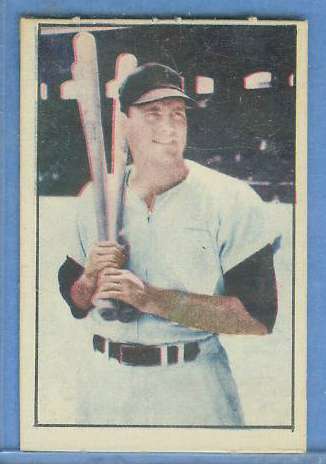
Today’s guest is one severe, disembodied dude. The preponderance of hair, almost meeting twice on both the middle and sides of the forehead, makes me think of dark alleys and unpaid loan sharks.

Card front (blank back)

Henry William Fischer came out of Yonkers just before World War II and the lightness of his Wikipedia article testifies to the relatively small impact his career made on 1960s baseball. He pitched for Boston in parts of two seasons and (surprisingly) threw the best ball of his life there, despite going 3-5 with 1 save in only 15 games. He only batted in 9 of them, so probably served as a spot reliever and emergency starter, and didn’t appear in the postseason.

Unrealized potential aside, Hank does appear in one of Topps’ more interesting 60s oddball issues. They printed two teams’ worth of paper-backed stickers in 1967, one of the Red Sox (who finished 9th in the AL in 1966), and another picturing the Pirates (who finished 3rd). Fischer's a good example of the Red Sox design, which screams “it's just a test issue, don't spend more than 10 minutes on each sticker.” Bodiless players float, smirk, and grimace over paste backgrounds and primary color shapes. Three stickers portray a boyish rooter with an art style usually seen on card backs. It’s amazing that this amateurish look preceded the 1969 Topps Supers (Yaz image linked) by only two years. I assume they circulated in their team-specific markets, both a short truck ride from T.C.G. headquarters in New York City.

Kids probably slapped these stickers on folders, wrapped them around bike frames, and otherwise made the set hard to finish. Most hobby examples come in decent shape, if only because collectors prefer unstuck versions. Lower grades often still possess a back, but exhibit stains, pen marks, or creasing. Mr. Fischer, around G/VG, came to my collection from eBay for $5. I recommend that type collectors get a hat-wearing player with a decent looking photo, even if it limits your selection somewhat. Joe Foy, George Scott, and Rico Petrocelli all look like sharp fellows you’d take home to Mama Binder.

Friday, January 2, 2009

1931 W517 Baseball #5, Chalmer Cissell

Anything prefaced by “W” in the card catalog means a strip card, so the W517s originally came in attached rows ready for cutting by a vending machine or scissors. Many examples, even the hatchet job that I own and picture here, show a vestige of dotted line along the edge.

Card front (green tint, blank back)

The 54-card, blank-backed set features real photos, a vast improvement over typical hand-drawn 1920s strip cards. You can find three forms of this set, large, small, and (what I've got) large-trimmed-to-small. The “mini” versions use the same image and proportions, but printed on a smaller paper strip. This probably made them cheaper to produce, a key consideration in the lousy 1930s economy. Multiple print runs created a handful of variations, including Mr. Cissell listed on both Cleveland and Chicago.

Chicago version (green tint)

The W517s present a decent, collectible group of newspaper-like player photos. A recent Robert Edwards auction shows off both an original photo (of Babe Ruth) and the final product. While its overall quality lacks refinement, the set compares well to the dearth of interesting cards (and poor card stock) from that era. The rising cost of all the HOFers makes it pretty hard to finish, but at least you only need a few dozen cards to do so.

UPDATE: Thee more scans of a Cleveland version and tint variations.

Cleveland, green tint

Chicago, purple tint

Chicago, red tint

Wednesday, December 17, 2008

1965 Topps Baseball #5, AL RBI leaders

The 1964 AL league leaders include a range of players and teams, all skilled with the bat. (Most are known for more besides.)
  • Ah yes, Mantle, Topps icon and regular run producer. He continued to light up the scoreboard, even as the late-1960s Yankees sank to the second division.
  • Harmon Killebrew's towering shots equaled the Mick in force, if not in lasting fame. Like other tailing sluggers from the mid-70s, Killer dipped a toe in the new free agent market to finish his career in Kansas City. One year, 14 HR, .199 batting average.
  • Dick Stuart, a.k.a “Dr. Strangeglove,” tallied more errors than round-trippers some seasons. Observers agree that every play at first felt like an adventure.
  • Finally (and firstly), Brooks Robinson, who took advantage of his prime of life to pound out 118 RBIs in 1964 and set career highs in many offensive categories. “The Human Vacuum Cleaner” added an MVP to his credentials that year, beating out a second-place Mantle.

    Card front

    Topps debuted league leader cards in the 1960 set and they continue to this day. Multi-player cards stretch back significantly further, both post-war and pre-war. As baseball fell increasingly under the spell of statistics, the cachet of plating the most runners or striking out more hitters than the next guy also rose. Hence, I assume, the desire to add this kind of subset to the mix. Perhaps it's also an easy way to get less-than-the-best photos onto cardboard. This LL card shows alternate poses for each player, kind of like home-and-away jerseys. One particular player jumped around enough that we need the Internet just to keep track of things.

    • The Mick's regular card shows him batting righty, kind of a cool switch from this lefty close-up.
    • Killebrew's #400 moves the portrait to a different angle.
    • Brooksie's smiling mug dominates his “regular” card, not far removed from 1957's rookie pose.
    • Dick Stuart's card throws a bucket of cold water over the whole process. First, the picture's clearly a hatless Pirate uni, probably taken in 1962. Pittsburgh traded him to Boston prior to spring training 1963. He indeed finished runner-up in 1964 AL RBIs, but the Sox shipped him to Philadelphia around Thanksgiving. Topps slapped a PHILLIES flag on the old photo and voila, he appears for both American and National League teams in the same set.