
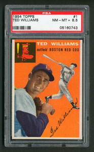
Card front
Note the eccentric top border, an edge-bleed color that overlaps one side of the print row to those above. The printer laid out the 100-card sheet with flip-flopping rows to achieve this effect, something visible in the Topps Archives blog profile. The overall look resembles a mis-cut, though spacing on the other three edges can confirm the centering as good, bad, or ugly.

Card back
The 1954 design clearly bridges the early big-card efforts to the mid-50s. Black-and-white body photos accent a tinted portrait against a solid background. This multi-image presentation moved to a landscape in 1955 and included full-field action shots in 1956, but saved full-color for 1957.
No comments:
Post a Comment