Wednesday, April 29, 2009

1937 Goudey Thum Baseball Movies #5, Wally Moses

In the early 20th century, many Americans stereotyped movies as low-class entertainment, rife with sex and violence. (Perhaps that's changed and perhaps not.) Evolving camera technology and filming techniques allowed Hollywood to move further from small stage settings and put the people and situations right in your face.


This fast-paced change in entertainment style garnered negative attention from conservative groups, notably the Legion of Decency. Many large cities, including baseball towns Boston, New York, and Chicago, proved receptive to its influence, paving the road for industry change. (See the 1910 Tip-Top Pirates #5 for a similar story with the Temperance folks.)

The LoD's coordinated social and political pressure led movie studios to make concessions on script and film content, primarily via adoption of the Hays Code. Prior to its 1934 enforcement, studios tackled a wide variety of issues, from race relations to the ambiguity of crime and justice. Dozens of “classic” genres, stars, and directors established themselves prior to the Great Depression, but soon felt the pinch of behind-the-scenes censors who reviewed all American-made scripts and films. Out went racy scenes, language, and sympathetic bad guys. In came screwball comedies and the G-Men. Movies didn't stop being good, but they had to tap dance around major issues with ever-increasing subtlety.

Content enforcement lasted for some time, enough that studios completely remade several existing films in order to work around problems with their pre-Code version. Filmgoers know Dashiell Hammett's The Maltese Falcon as the classic 1941 film starring Humphrey Bogart. The little-seen 1931 version practically disappeared under the code's influence and picked up an alternate name (Dangerous Female) to avoid later confusion between the two.


As movies entered a decade of behind-the-scenes turmoil, baseball cards bloomed. Goudey even mixed the two with this “card” set, a series of marquee-style flip books. Zip through one to see a "live" player making a quick play, pitch, or batting move. Thum Movies cost 2 cents and included player bios and some commentary on the backside. The writing's pretty close to what you get from their standard card sets, but I liked the unintentionally humorous subscript of "Your Favorite Stars in Action! Pitching! Batting! Running! Catching! etc." (I assume scratching and spitting fall into the "etc." category.)

See the Old Cardboard set profile for a bit more info and Baseball Almanac's version for the full player checklist. It'd be fairly hard to build a full set these days, given the rarity of individual books. This issue also contains one of Joe DiMaggio's earliest appearances, a full year prior to the 1938 Heads Up set.


This scan shows the first page, with bat cocked and ready to swing. Each book zips through exactly 24 images, what folks now consider the standard speed for one second of movie projection. There's a problem with what you see here, though. If that's Wally at the plate, he's pulling a fast one on the movie man and swinging right-handed, even though he was a southpaw hitter and fielder. Personally, I think it's a different player altogether, something that happens from time-to-time on cards.

Update: Old Cardboard added details on a similar flip book set that's 30 years older than this Goudey set. Check out the 1906 Winthrop Moving Picture Postcards profile for details and an animated scan of the subject, HOFer Three Finger Brown's fastball.

Update #2: Red cover variation spotted on eBay.


Value: I bought this Moses book for $10 several years ago. Recent eBay actions are closing between $30-50 for Hall of Famers and probably half that for non-stars.

Fakes / reprints: It'd be a lot of work to fake a whole flip book, but beware of buyers selling single superstar pages, as copying them would be trivial. (I've seen separately graded individual pages of players like Joe DiMaggio, a dubious prospect at best.)

Friday, April 24, 2009

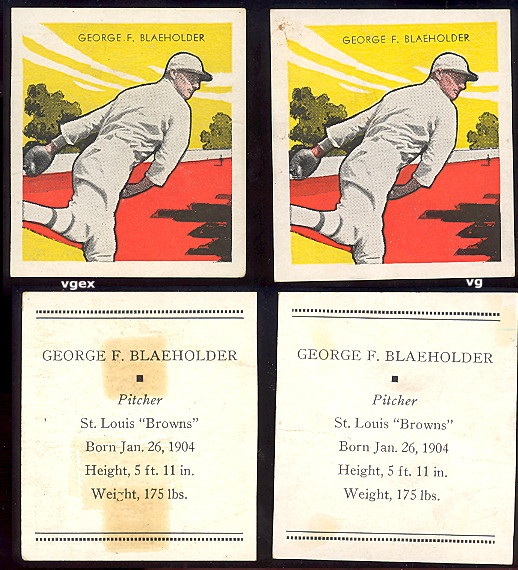
1921-1930 Major League Baseball Die-Cuts #5, George Blaeholder

It took me a while to give in and purchase this card. It’s got a pitching pose, but doesn’t resemble anyone in particular. Generic pants, lumpy shirt, and preternaturally stiff jersey sleeves complete the look of “five-minute sketch of man in woolen uniform.” At least it’s all done in sepia tones, matching the St. Louis Browns’ coffee stain history as an American League doormat in the 30s. Not too motivating, but I eventually found one for $5 and made the deal.

Card front (blank back)

The player in question, George Blaeholder, remained constant on the Browns from 1928 to 1934, taking the ball when asked and annually winning (and losing) at least 10 games. He moved on to the A’s in 1935, “achieving” a decent ERA+ mark but still going 6 and 10. That year, Philly beat St. Louis to the cellar by winning only 58 games under HOF manager Connie Mack. People often speak wistfully about players that play their whole career for one club; Mack served the A’s for half a century, helming the team from 1901 to 1950.

You deserve a more recognizable image of George Blaeholder, so check out his various cards from the 30s and 40s. The Goudeys and Diamond Stars look great as always, but I have a soft spot for the in-your-face color of the Tattoo Orbits. The high-contrast tones and action angle remind me of classic Soviet propaganda posters.


This particular set's actually pieces taken from a board game called "Major League Ball - The Indoor Game Supreme." (OldCardboard.com attributes the set to National Game Makers Company of Washington,D.C.) It kicked off in 1921 with at least five teams and a simpler design, listing only name, fielding and batting position, and team. Perforations, visible in the picture, connected the players horizontally and the maker post-fixed labels with name, position, and other details. Team sets (or label updates) came in an single envelope and were probably available through toy stores. The SCD catalog lists updates throughout the 1920s based on when players suited up for a given team. Blaeholder, for example, started pitching regularly in 1928, so only appeared after that time.

I started seeing these guys at shows more frequently in the last five years. It’s hard to recommend them unless you have a very specific interest, like a certain team, player, or (cough) type collection. The blasé player images and odd set construction do mean relatively low prices. This might be the cheapest way to recreate a classic lineup like the 1927 Yankees, though Ruth still runs hundreds of dollars in good shape. I point people back to the '33 and '34 Goudeys, since they're so much more attractive and informative.

Monday, April 20, 2009

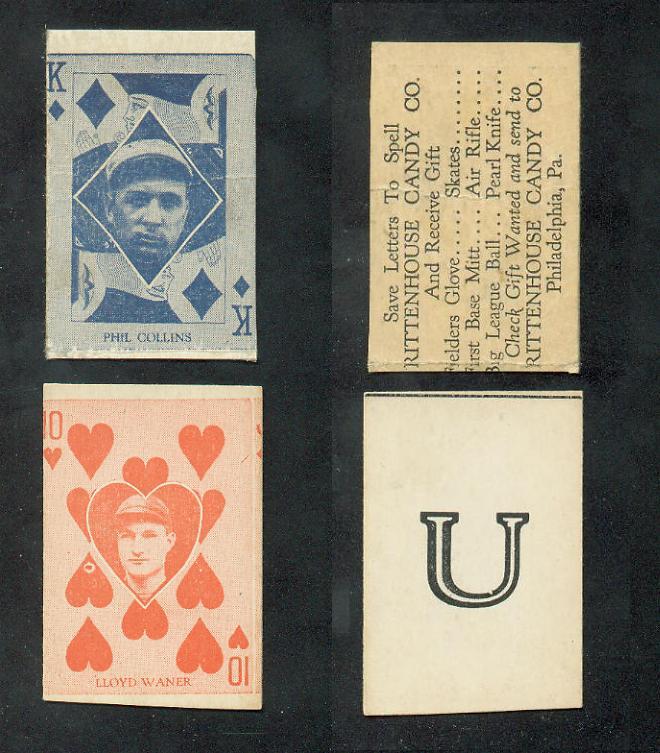
1933 Rittenhouse Candy #5, Al Simmons

Reach back far enough into baseball’s misty past and you unearth marvels like HOFer Al “Bucketfoot” Simmons on this decidedly playful card. Printed on thick newsprint, it's a bit more than 2 inches high and bit less of that wide. That makes the actual player picture very small, slightly larger than a thumbnail. At least Al looks happy to be there.

As you might guess, the set numbers 52 cards total, with four suits of ace through king. The cherry red background would stand out almost anywhere, but cards also come in lime green and blueberry. See this list of pages for interesting E285 front and back variations.

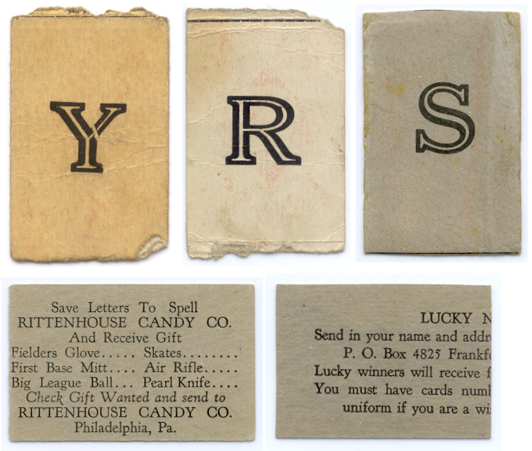
The set profile shows off most of the known card backs, which included a redemption contest. 1933 collectors that built the phrase “RITTENHOUSE CANDY CO” could send away for a fielder’s glove, first-base mitt, (roller?) skates, air rifle, pearl knife, or baseball. My inner child is now drooling.

This card appears in my blog because not every back included a letter. Mr. Simmons features the nice, big #5 pictured at right. Relatively few Rittenhouse cards made it into modern collections and this is the first I've seen with a number. Lots of reasons for set scarcity come to mind.

  1. Being strip cards, young collectors could easily cut them poorly and leave ragged edges
  2. The playing card design encouraged lots of use and handling
  3. I assume the production company kept anything sent back for redemption
  4. Goudey Gum produced an amazing baseball set the same year, with design and quality that far outpaced the E285s
  5. 1933 was a long time ago
You can see from the simple design that it’s one of 1930s’ lesser issues, but rarity keeps the value of Rittenhouse cards fairly high. Expect to pay $50 or more for a decent example. I recommend pursuing the 1933 or 1934 Goudeys (~$10 each in low grade) before you even think about building a set of these ugly ducklings.

Monday, April 13, 2009

1968 Atlantic Oil Baseball AL #5, Frank Robinson

This Atlantic Oil set, given away as an on-site promotion, reflects an explosion of late-60s licensing by the MLB Players Association. Clad in a blacked-out cap and generic jersey, Frank Robinson encourages you to pair him up with AL #4 (who I think was Tommy Davis) and win $100. Just like rare properties in McDonald’s Monopoly games, they printed the other card in significantly smaller quantities to avoid giving away money.


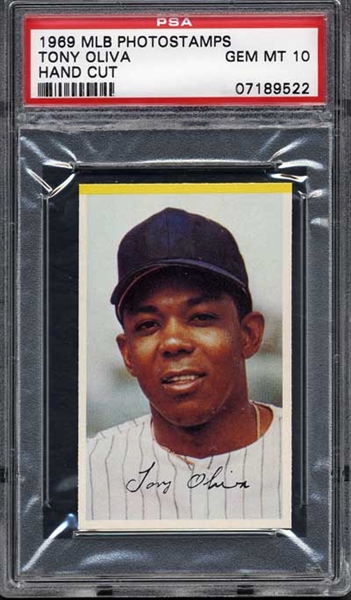
The lack of distinctive logos, team insignia, and player numbers reflects the changing nature of 50s and 60s product licensing. Major league players, through the MLBPA, used their emerging market clout and union strength to make two big steps. First, they negotiated a collective bargaining agreement with the team owners in 1968, a move that later dovetailed into full-scale free agency. Second, they signed a burst of licensing deals that paraded recognizable players across an ever-blander list of “collectibles.” One could argue the league and the players both diluted their brands with MLB’s 1969 expansion to 24 teams and oddities like MLBPA PhotoStamps, pins, and superballs.


In that vein, The Fleer Sticker Project profiled Topps’ on-again, off-again use of the Houston Astros name and logo in the late 60s, which follows from negotiation with baseball owners over their trademarks. For even more quality history, check out The Team That Topps Forgot by Dave Hornish. Both give a good sense of the cranks and characters trying to stay on top in a changing business and how that played out on the cards themselves. 

1967 Dexter Press set contains a more satisfying version of Frank's original photo for this Atlantic Oil card.


That's a Florida sky behind Frank, where Baltimore held 1960s spring training. This pre-press photo shows their 1965 team before a game in Winter Garden, Florida, preseason home to then-rival Washington Senators.


Find more contemporary shots of those Orioles at a spring training retrospective by The Baltimore Sun.

Frank Robinson and others in 1968 Atlantic Oil also appear with this back variation of a game picture instead of game rules. It includes the © MLBPA relevant to that era's changing licensing landscape at lower-left.


Atlantic Oil printed four different #5s for this contest and Frank's one of the easiest to find.

Value: Frank cost a few dollars in an oddball box, about average for low-grade oddball sets from this era. Fellow #5 Ernie Banks remains a white whale for my type collection, since Atlantic Oil short-printed him for the $100 contest prize and few survive today.

Fakes / reprints: Haven't seen fakes in the marketplace, but it's possible for rarities like Banks. Look for the perforated edges, as each player came on a sheet.

Saturday, April 11, 2009

Update on #5 type collection progress

This blog's type collection includes all known sets from baseball's majors, minors, and foreign issues. It limits the "target" to only sets with cards numbered 5. This significantly reduced the total count, since SCD "big book" listings number into the thousands, but still includes almost 450 different issues.

Topps represents more of those sets than any other single company. Oddball makers, such as TCMA and several regional food companies, also figure prominently. Note that "oddball" doesn't describe the player on the card, or we'd get a complete list of the recently mentioned Oscar Gamble afro cards.

Breaking the type collection composition into decades shows two things. First, the total number of sets started slowly and held steady though the 1940s. The rarest cards come from the pre-1920 era, including some sets that number beyond #5, but haven't identified that specific card yet. (Perhaps they'll eventually turn up, perhaps not.) Second, production totals rose sharply after WWII, roughly in tune with the maturing Baby Boom generation's buying power and westward league expansion. Many new industries tried out baseball-related promotions, including tea companies, cookie bakers, and potato chippers. With much smaller production runs than Topps, these cards prove hardest to track down, eBay or no eBay.
  1. Decade: # owned of # possible
  2. Pre-1920: 10 of 16
  3. 1920s: 16 of 29
  4. 1930s: 23 of 30
  5. 1940s: 21 of 26
  6. 1950s: 43 of 54
  7. 1960s: 61 of 84
  8. 1970s: 163 of 195
  9. Total: 337 of 434 (78%)
This blog profiles about 80 different sets so far, just under 20% of what's possible. Even one page per set would create quite a book by the time we're done. I plan to continue writing about two or three cards per week, which means another few years (at least) to address them all. Let me know if particular eras or aspects of the hobby appeal to you and I'll do my best to include them in the #5 profiles.

Sunday, April 5, 2009

1977 Bob Parker "More Baseball Cartoons" #5, Doug Flynn

Pro artist Bob Parker, known in baseball circles for cartoons he drew for classic Topps card backs, based several sets in the 70s and 80s on his own player drawings. This 1977 issue profiles a mix of players, 24 in all, spanning a number of baseball eras. The #5 features Doug Flynn, a decent shortstop best known as part of CIN's trade for Tom Seaver.

Like most of Parker’s other sets, "More Baseball Cartoons" comes on thin, over-sized card stock without finishing gloss and I assume he printed them for sale direct to collectors. The backs are blank, so what you see here is what you get.


Parker's art style evokes the second half of Goudey's 1938 Big League Gum, with batting and fielding poses encircling a portrait sketch. I find this homage charming and wish more contemporary issues did the same. This set uses a mix of formats, including full and multiplayer poses, giving you every animal in the barnyard to look at. (Gallery of a PSA set.)

Bob made this set avant garde by producing it himself during an era when few could. These days, artists can turn out a more polished product, given computer drawing tools and a quality inkjet printer. Publishing your own card sets really meant something in the President Carter years. While fellow artist Robert G. Laughlin created similar oddball sets in the same generation, Parker’s "Topps card back" style remains tough to beat.

Value: I found this #5 for a $2 at a show many years ago. Complete sets and singles also appear on eBay and elsewhere online.

Fakes/reprints: This set's scarcity insulates it somewhat from reproduction. Real cards are oversized and come on rough orange paper, two aspects almost unique to this set. Any examples sized like typical baseball cards won't be from the original set.

Monday, March 2, 2009

1939 Gum, Inc. "Play Ball America" Baseball (aka "Play Ball") #5, Luke Sewell

We've gone back to the future by including Luke Sewell, younger brother of previous #5 guest (and Hall of Fame shortstop) Joe Sewell. Though he lacked the elder's powerful stick, durability and defensive skills sustained Luke's 20-year career behind the plate. Several years of managing followed, when he notably led the 1944 St. Louis Browns to their only pennant. That year's World Series also marked the last time both league winners shared the same home stadium. The cross-town Cardinals beat them in a six-game World Series that drew little national interest, given WWII's distractions and the moribund talent levels league-wide.

Card front

Manufacturer Gum, Inc. used real black-and-white photos on this debut set, splitting the composition between portraits and Sewell-like action shots. This marked a real change from Goudey's colorful 1930s efforts and Play Ball's follow-up sets (1940 and 1941) continued with a very similar, newspapery look.

Dozens of card companies tried their hand with baseball in the 1930s, but America's war effort sucked up almost all the cardboard from 1942 to 1947. Only rag stock remained, which led to sets like the poorly regarded MP & Co (checklist at GFG.com). Bowman finally picked up the major league baton in 1948 with a 1939 Play Ball look-alike of 48 cards and Topps finally pushed everyone past the age of small pictures with their 1952 set.

Red overprints are Gum, Inc. salesman sample cards

Gum, Inc's salesmen brought these overprinted cards to candy stores as promos to build retailer interest. A small number remain in the market and some collectors even specialize in them, though I'm not sure if it's possible to build a full set.

UPDATE: Thanks to 1939baseball.com, we get a look at Play Ball's wrapper and box stylings.


Baseball put a lot of effort into celebrating 1939 as the centennial of baseball, so this wrapper included a parade of game uniforms.


Value: Low-grade, low series Play Ball commons like Luke Sewell cost a few dollars each. Major stars like Joe DiMaggio and Ted Williams will cost you whatever you have. Seriously, it's enough money that you should just put your wallet in the freezer now to accumulate as much cold, hard cash as possible. Unfortunately, pre-war star card values don't drop much in a down economy, since you only need a few well-heeled collectors to maintain competition and high market prices.

Fakes / reprints: Full set reprints do exist, but probably not singles of Mr. Sewell.

Friday, February 20, 2009

1955 Red Man AL #5, Bob Grim

Looking decidedly wistful here, and anything but "grim," today's guest kicked off his major league career with a bang, going 20-6 in 1954. This earned him AL Rookie of the Year and he followed with three more years of relative success, posting a 45-21 record in pinstripes before being traded to Kansas City.


Card front

His Wikipedia entry notes how arm troubles prompted a successful conversion to relief pitching, which no doubt prolonged his career in a sport where young players can fall off the planet in no time at all. Grim's career eventually ended in 1962 with the A's, but his stats change notably after those four seasons in New York. I wonder where today's pitching strategies and medical care would've taken him, compared to the 1950s and four-man rotations.

Like other Red Man issues I've covered, this over-sized, beautifully painted card design stands out among oddballs. They look a lot like Topps' 1953 cards, but repeated for several years running. Each tobacco pouch included a card ("for your boy!") with the chaw ("not for your boy!"), and printed one numbered set per league. See the RedManCards.com checklists for the full star power of the day and pictures of some ad placards. (Lest you think I made up the "for your boy" stuff.)

Thursday, February 12, 2009

1980 Topps Superstars #5, Jim Rice

Cheer up, Mr. Rice, you’re in the Hall of Fame! Some thought you’d make it, others held you shouldn’t, and it dragged on long enough that still others debated the debating. I just marvel that your hair looks so good on TV!


Card front (5" x 7")

I read through Jim’s Wikipedia entry to better understand all of the blather and palaver. The last section calls out a bunch of interesting similarities to fellow HOFer Ducky Medwick, who played for the Gashouse Gang in St. Louis. Unfortunately for Rice, people who know the political history of the Hall consider Ducky’s era (and even the Cardinals specifically) unfairly over-represented. Perhaps the linking’s meant to be supportive—their circumstances do align remarkably well—but peripheral issues take you in a different direction.

All this observed, I care much for cards and not so much for the Hall itself, so hey—1980 Superstars! Topps crafted these 5”x7” beauties as an oddball companion to the normal 792-card set. Each paper-wrapped pack contained a handful of big, sharp photos and the checklist includes 59 of the era’s best players…and Sixto Lezcano. (Zing!) Curiously, the back states only the player name and team, a dearth of data drowning in dreary grey newsprint.

Two things bother me about this issue. First, the pictures seem like spring training one-offs. Rice’s pose, a pretty uninspiring shot, looks better than 90% of his competitors. Everyone else is looking away from the camera, caught at odd angles, or just not feeling their best. Hey Topps, how about using all that real estate to show a nice action shot? Second, the card backs say almost nothing, a real waste of 35 square inches of space. How about using them to make a big All-Star roster puzzle like they did with 1977’s cloth stickers? A few strategic changes would’ve made them super Superstars.